Many businesses have started to discover and use ConversionCow popouts to drive engagement and improve conversion rates. However, some business owners may find themselves only receiving a few leads and wonder how to boost their website performance to get more.
The truth is, simply adding a ConversionCow popout on your website is already a great start but you can take this a step further. By that, a thoughtful setup is key. Proper configuration can turn it into a powerful asset for capturing more leads and driving conversions.
Without the right setup, you risk missing out on valuable opportunities and your popout could even become an ineffective or just another disruptive element to your visitors.
Why Optimal Configuration of ConversionCow is Important
When setting up your popouts, you don’t just want to follow the standard steps and pre-built details provided to you. You also need to inculcate your business’s unique value proposition (UVP) and branding.
Here are key statistics on why highlighting your UVP and branding on your website is important:
- A strong UVP can increase conversion rates and improve website traffic (Lifesight).
- 82% of businesses fail due to poor differentiation (Website Builder Expert).
- Consistent branding across all platforms boosts revenue by 23% (Website Builder Expert).
- Clear UVP improves employee engagement by up to 20% (Website Builder Expert).
- Strong UVP reduces customer acquisition costs by 50% and increases retention by 27% (Lifesight).
Effectively setting up ConversionCow is crucial for maximizing user engagement which in return will drive conversions. Optimizing your popout with the right element can instantly catch the visitor’s eye, provide relevant information, and guide them smoothly through your sales funnel.
Effective Strategies to Get the Best Out of Your ConversionCow Features
Popout Tab

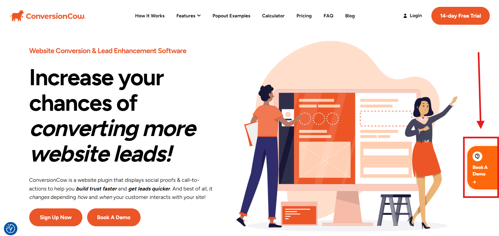
First, we have the popout tab. This is the most crucial ConversionCow setup popout element that most users often ignore – or maybe are not aware of.
Regardless, the popout tab is extremely important as this is the first thing visitors see. It serves as an invitation to engage with your content, so it needs to be compelling right from the start. Remember, if no one clicks on the tab, they won’t see the valuable information and offers that follow.
Keep it simple yet eye-catching or use strong language like “Get a Free Estimate Now” or “Try It for Yourself!) to encourage clicks.
Layouts
Make sure that you are choosing the right layout that matches your goals and objectives. Some common objectives are the following:
- Collecting leads
- Acquiring appointment bookings
- Offering quotes
- Driving sales
Regardless of what you are aiming for, ConversionCow offers about 30+ template combinates that are optimized to cater to all your business needs. All you need to do is to choose which one will work best for you.
For example, templates like “Get an Instant Quote” or “Limited Offer” can guide users to take immediate action and push them deeper into your sales funnel. ConversionCow also has an A/B testing feature that you can use to see which layouts perform best on your website.
Here are popular hard conversion layout templates that you can try:
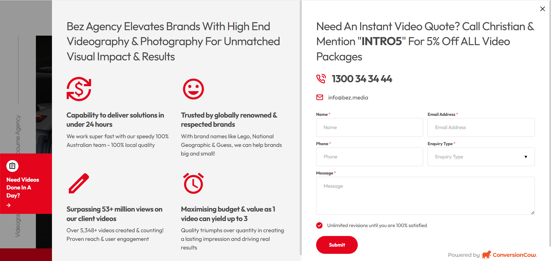
Videos + Enquiry Form

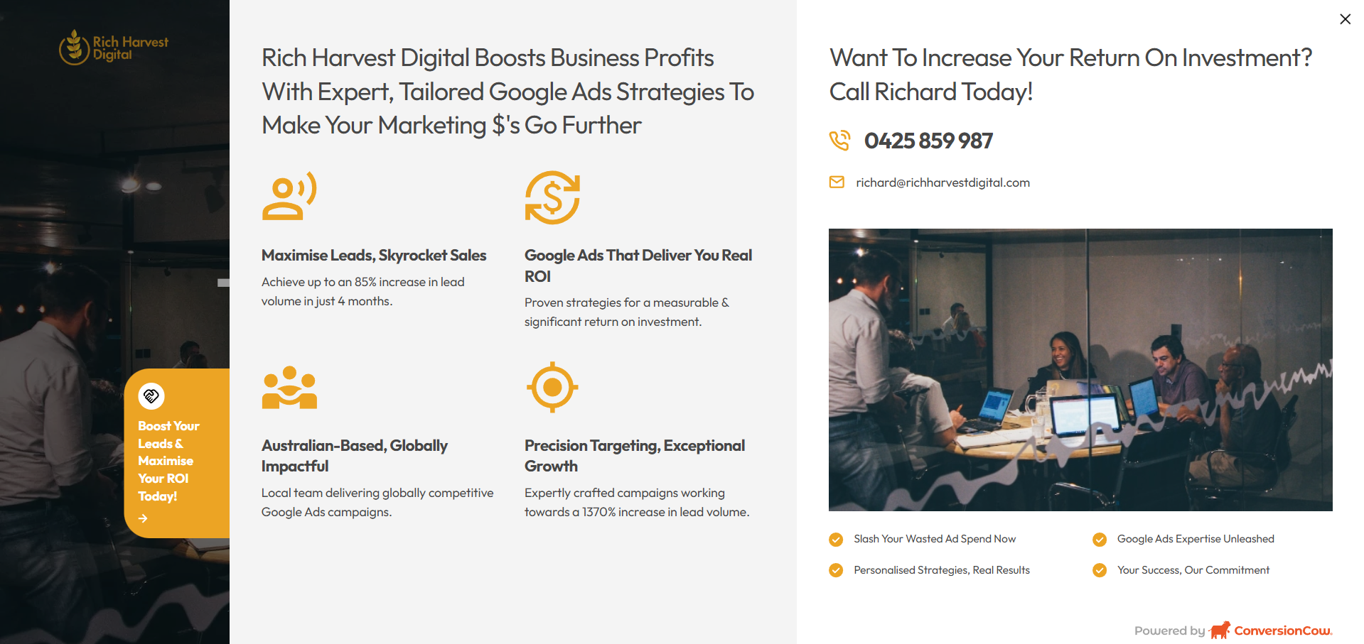
Proof of Points + Primary Details

Iconography & Text
You also need to optimize the icons and text on your popouts – especially the actual button icon, and if you are using the proof of points template.
You need to work on your icons and text not just for capturing attention. Primarily, that is its main purpose. However, you also need it to easily convey information without overwhelming visitors with text and visual clutter.
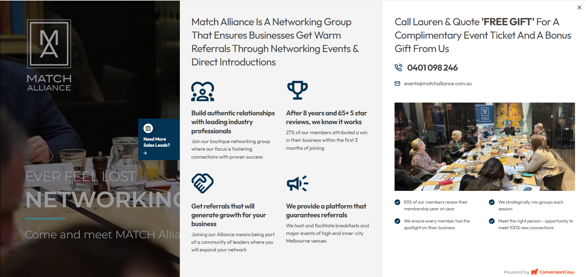
Let’s take a look at Map Alliance as an example:

As you can see, the website doesn’t just list the benefits or what they offer. Instead, most of the text on their popout is accompanied by an icon. This greatly helped to improve the popout’s readability but also emphasized key points that prospects should look at and encourage them to perform the action you want them to take.
Here are some examples to enhance your text and iconography:
Icons:
- Shopping Cart: Used for sales promotions to signify purchasing options (e.g., in a template promoting a discount on mapping services).
- Calendar: Ideal for appointment booking features, such as scheduling a consultation for mapping projects.
- Envelope: Represents sign-up forms for newsletters or updates about new mapping tools.
- Phone: Indicates customer support options, allowing users to reach out for assistance with their mapping needs.
- Map Pin: Perfect for emphasizing location-based services offered by Mapalliance, helping users understand the geographical focus of their offerings.
Text Tips:
- Focus on immediate customer benefits (e.g. offering discounts or limited availability)
- Avoid vague messaging
- Use action-packed CTAs like “Get $1000 Off Today!” or “Only 3 Spots Left!”
If you are struggling with this, ConversionCow’s headline generator can help with suggestions to get started. However, this generator is only meant as a guide, so make sure to still add your input to make your copy unique and action-driven.
Branding
According to studies, consistent brand presentation can increase revenue by up to 23%. It plays a crucial role across all existing elements of your popouts, especially in building trust and brand recognition.
So when visitors encounter a popout that matches the look and feel of your website, it creates familiarity and confidence in your brand.
For example, if your brand identity emphasizes professionalism, consider using clean fonts and muted color schemes in your popouts to reflect this. But if your brand is more playful, vibrant colors and energetic language will help your popouts feel more integrated.
Here are some tips to inculcate your brand identity in ConversionCow popouts:
- Apply your primary and secondary brand colors to pop out backgrounds, buttons, and text for a consistent look
- Add your brand logo to popouts for immediate brand recognition.
- Use fonts that align with your brand’s style to keep messaging visually consistent
- Write popout copy using the tone and style that matches your brand’s voice
- Add images or illustrations that reflect your brand’s style and messaging
- Customize call-to-action buttons with phrases that reflect your brand’s unique style
- Use popout text to emphasize key brand messages, such as sustainability or quality
- Feature unique brand offers or discounts that distinguish your business from competitors
Color
The psychology of colors is powerful in influencing user actions. It can evoke emotions and even influence user decisions.
For instance, vibrant colors like red or orange can help create urgency while green can convey trust and safety. Just make sure your color scheme complements your website’s branding, but still stands out enough to direct attention to your popout.
Call to Action (CTA)
Your CTA is crucial for conversion success. It is responsible not just for capturing attention but leading your site visitors down to your sales funnel right away.
Make it bold and unambiguous, so that users know exactly what action to take. Here’s how you can do it:
- Encourage immediate action by using time-sensitive language
- Start with strong verbs like “Download,” “Register,” or “Get Started”
- Limit your CTA to a few words to ensure it’s easily digestible
- Position CTAs where users are likely to take action
- Experiment with different wording, colors, and placements to find what works best
- Ensure your CTA is relevant to the content it follows for a seamless user experience.
- Highlight benefits to entice users to take action
Wrap Up
These are everything you need to know about setting up your ConversionCow popouts.
Remember, properly setting up ConversionCow popouts is essential for maximizing lead generation and driving conversions on your website. This not only enhances user engagement but also significantly impacts your overall marketing performance.
Ready to double the value of your sales and make your business thrive and become sustainable? Start leveraging these features now to unlock the full potential of ConversionCow and boost your growth in no time.
If you haven’t tried ConversionCow yet, we also offer a no-obligation 14-day free trial to test out how we can help improve your website lead generation and conversion.


